Material You vs Apple Design: The Battle Between Personalization and Simplicity in Modern UX
Material You vs Apple Design
Introduction: Two Different Perspectives on a Shared Problem
When we talk about mobile design, we are essentially discussing two different worlds: one shaped by Google and another carefully crafted by Apple Inc. with precision and meticulous attention.
This difference is not just about colors or icons; it reflects deeper perspectives on the user, control, freedom, and even the definition of a “good experience.” For teams like Pishgaman Lotus, understanding these differences is a real competitive advantage, as choosing each approach directly impacts product success.
Material You: When Design Comes to Life
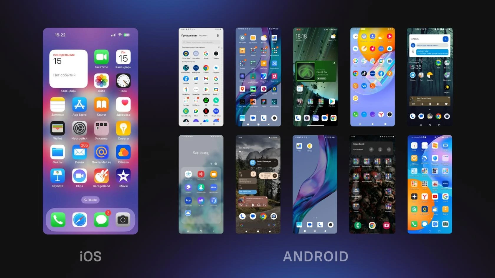
Material You, introduced by Google, represents a fundamental shift in how we think about design. In this approach, design is no longer something created once and applied uniformly to all users; instead, it becomes a dynamic system that adapts itself to each individual user.
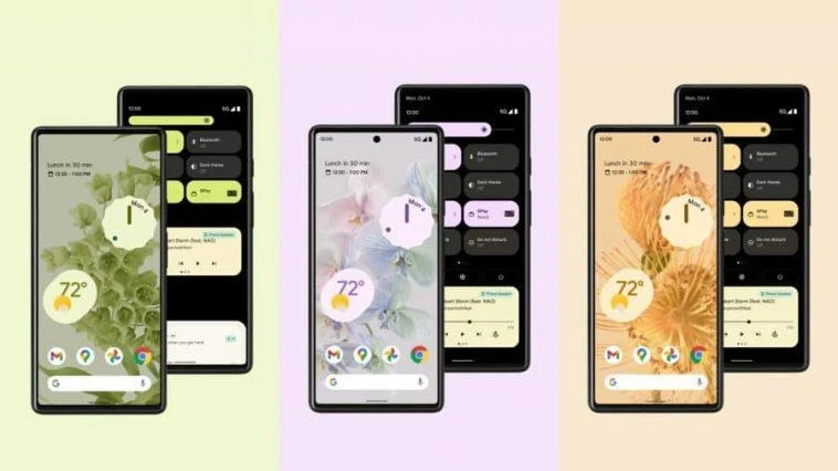
In this philosophy, every user’s device can look completely different, even if they are using the same model. This is made possible by a system that extracts colors from the wallpaper and uses them to shape the entire interface. In other words, design is no longer static—it is generated.
From a user experience perspective, this approach creates a strong sense of personalization and ownership. Users feel that their device truly belongs to them rather than being a generic product. However, this flexibility can also introduce challenges. For example, some color combinations may reduce readability, or consistency between different apps may be lost.
For teams like Pishgaman Lotus, this model means that designing a single fixed UI is no longer sufficient. Instead, designers must build systems that deliver a good experience across varying conditions. This transforms design into an intelligent system rather than a fixed output.
Apple Design: Control, Simplicity, and Predictability
In contrast, Apple Inc. has chosen a completely different path. Design in Apple’s ecosystem is built on principles such as simplicity, consistency, and full control.
Here, users have less freedom to change the appearance, but in return, they receive a highly stable and predictable experience. Apple believes that if design is done correctly, users should not need to constantly modify it.
This philosophy has resulted in iOS applications that look and behave similarly. This similarity is not a weakness but a strength, as users can easily navigate new apps after learning one.
From a user experience standpoint, this approach reduces cognitive load. Users do not need to think or make many decisions, as everything follows a clear and consistent pattern.
For Pishgaman Lotus, this design style highlights the importance of consistency. In many projects—especially large-scale ones—a predictable experience can be more valuable than visual excitement or personalization.
Different Views of the User: Freedom or Guidance?
One of the deepest differences between these two approaches lies in how they perceive the user.
In Material You, the user is seen as an individual with unique preferences who should be able to customize the system’s appearance. This means greater freedom, but also greater responsibility in making choices.
In Apple’s design, the user is viewed as someone who should receive an optimized, pre-designed experience. Here, the system makes key decisions to reduce complexity for the user.
For Pishgaman Lotus, choosing between these approaches depends on the product. If the product targets professional or advanced users, greater freedom can be an advantage. However, if the goal is simplicity for a broad audience, more control is often the better choice.
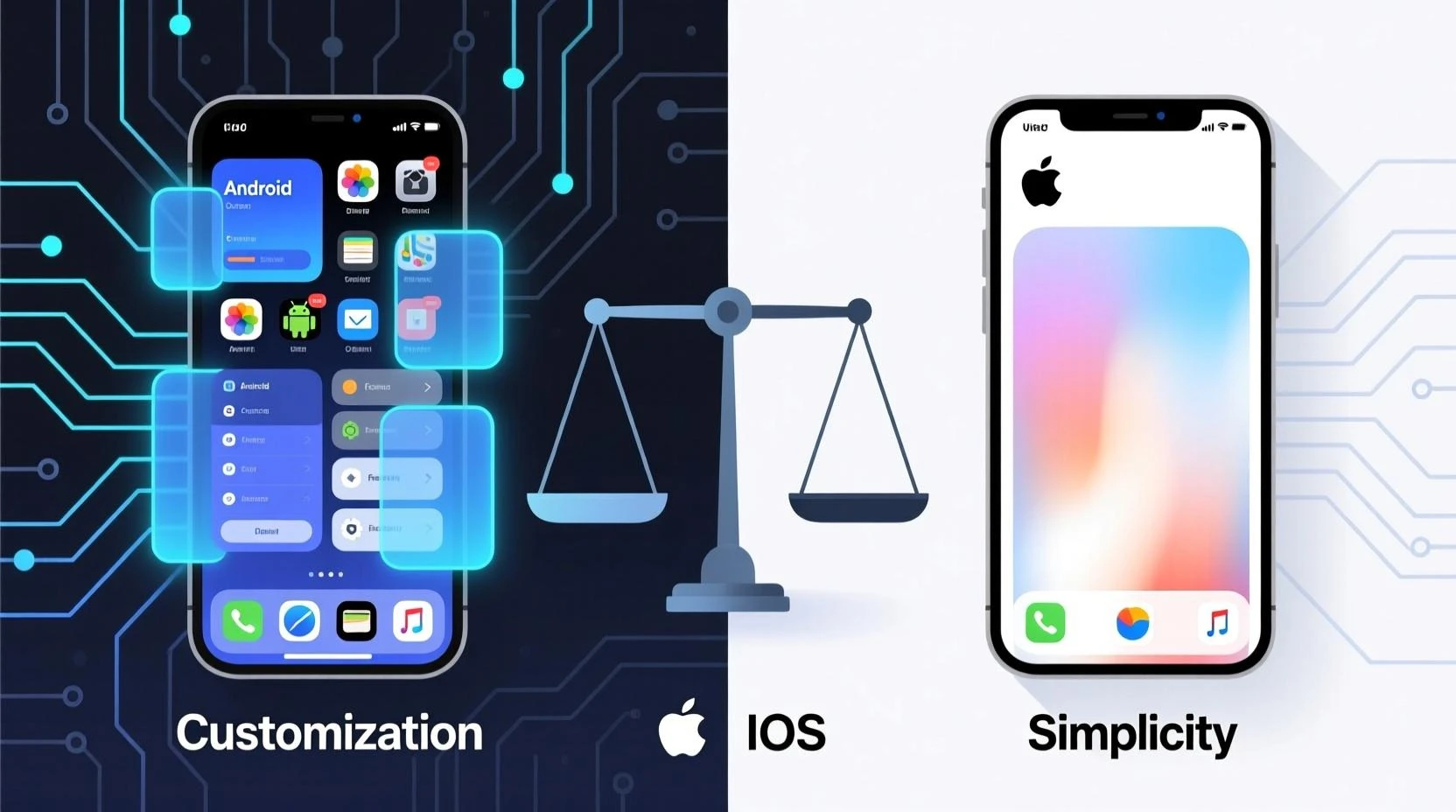
Visual Language: Color, Space, and Motion
Visually, the differences are clearly noticeable. Material You uses dynamic colors, soft shapes, and lively animations. This creates a sense of energy and movement, leaning toward a more emotional experience.
On the other hand, Apple’s design is far more minimal. The use of whitespace, precise typography, and limited color palettes keeps the user’s focus on content rather than the interface itself.
For Pishgaman Lotus, this demonstrates that design is not just about aesthetics—it is about conveying the product’s purpose and feeling. An entertainment app may benefit from the Material You style, while a financial app may align better with Apple’s approach.
Developer Experience and Implementation Challenges
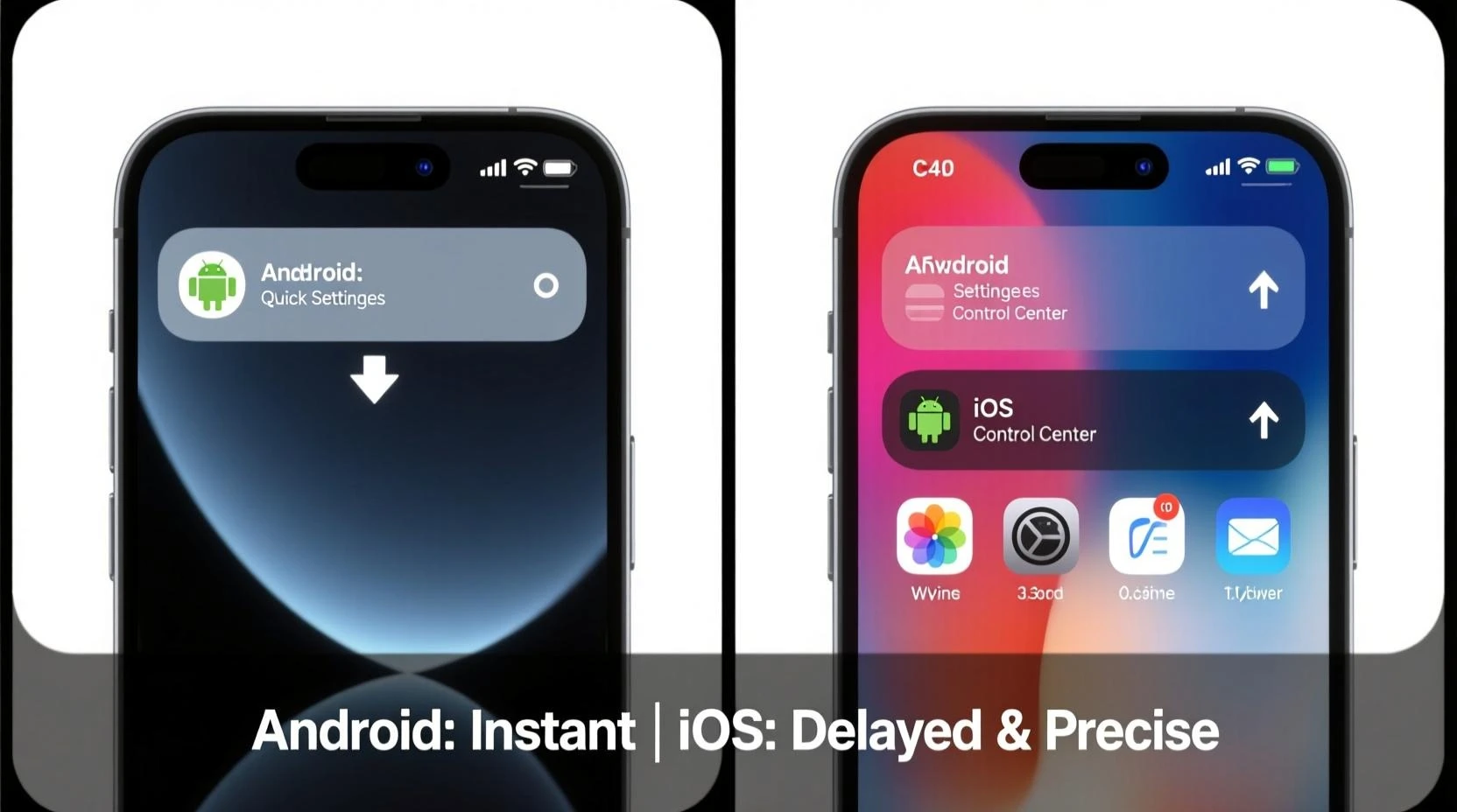
From a developer’s perspective, these two approaches present important differences. Material You requires building components that can adapt to various conditions, leading to greater complexity in both design and implementation.
In contrast, Apple’s design system—with its clear rules and constraints—makes the development process more predictable. Developers know exactly what to build and what is allowed.
For Pishgaman Lotus, this difference translates into a choice between flexibility and simplicity in development. Each approach comes with its own benefits and trade-offs.
The Future of Design: Convergence or Competition?
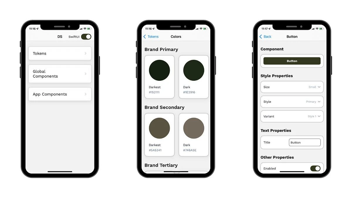
With the advancement of artificial intelligence and data-driven systems, the future of design will likely move toward a combination of these two approaches. That means systems that offer high levels of personalization while still maintaining consistent principles to ensure quality experiences.
For companies like Pishgaman Lotus, the future belongs to teams that can balance these two worlds—providing users with freedom while maintaining a reliable and stable experience.
Conclusion: Choosing a Philosophy or Creating a New Path
Ultimately, neither approach is absolutely superior. Material You represents a dynamic and personalized future, while Apple’s design symbolizes stability and control.
For Pishgaman Lotus, the key takeaway is to view design not as a trend, but as a problem-solving tool. Each product requires its own approach, and the best design is the one that creates the most value for the user.
Our articles:"Apple & Google Privacy Revolution: Rewriting the Rules of App Development"
Similar Blogs

Financial & Cryptocurrency App Security: Building a Hack-Resistant Mobile App

The Future of Cross-Platform Development: Flutter, React Native & AI
Smartwatch App Development
Have special project to begin?
Contact us if you need a unique website for your special requirements, if you think having a mobile application help you reach your business’s goals or you still do not recognize which product can help you implement your ideas. Lotus Pioneers accompany you to develop your business through consulting and by designing special products.