From Touch to Click: Key Differences in Mobile vs Web UI Design
Key Differences in Mobile vs Web UI Design

Introduction
In today’s digital world, the first interaction users have with any product is through its user interface. This interface is what users see, touch, and engage with. If the experience is not intuitive, fast, and visually appealing, even the most innovative ideas can fail.
User Interface (UI) design goes beyond aesthetics. It plays a critical role in guiding user behavior, improving engagement, and ensuring overall product success. With the rapid growth of digital platforms, designers now face two major environments: mobile applications and web interfaces.
At Pishgaman Lotus, we believe that understanding the differences between these platforms is essential for creating effective and user-friendly products. In this article, we explore mobile and web UI design in depth, highlighting their unique characteristics, challenges, and best practices.
Mobile UI Design
Designing for mobile means working within a small yet highly personal space. Users often interact with mobile apps while on the move, in distracting environments, or with limited attention. This makes simplicity and speed crucial.
Every element in mobile UI must serve a clear purpose. Limited screen space requires designers to eliminate unnecessary content and focus only on what truly matters. Touch interaction also introduces unique considerations such as button size, spacing, and gesture-based navigation.
Mobile apps offer powerful advantages, including access to device features like camera, GPS, and push notifications. These capabilities allow for more personalized and interactive experiences. However, designers must also deal with challenges such as screen size limitations, battery consumption, and platform differences between iOS and Android.

Web UI Design
Web design provides a more flexible and spacious environment compared to mobile. Users typically access websites from desktops or laptops, often in a more stable setting using a mouse and keyboard.
One of the most important aspects of web UI design is responsiveness. A website must adapt seamlessly to different screen sizes, from large monitors to tablets and smartphones. This requires careful planning of layouts, grids, and content hierarchy.
In web design, information architecture plays a vital role. Users should be able to quickly understand where they are and how to navigate to their desired content. Accessibility is also a key factor, ensuring that websites are usable for all individuals, including those with disabilities.
While web platforms offer advantages like easy access without installation and quick updates, they also come with limitations such as dependency on internet speed, browser compatibility issues, and restricted access to device hardware.

Key Differences Between Mobile and Web
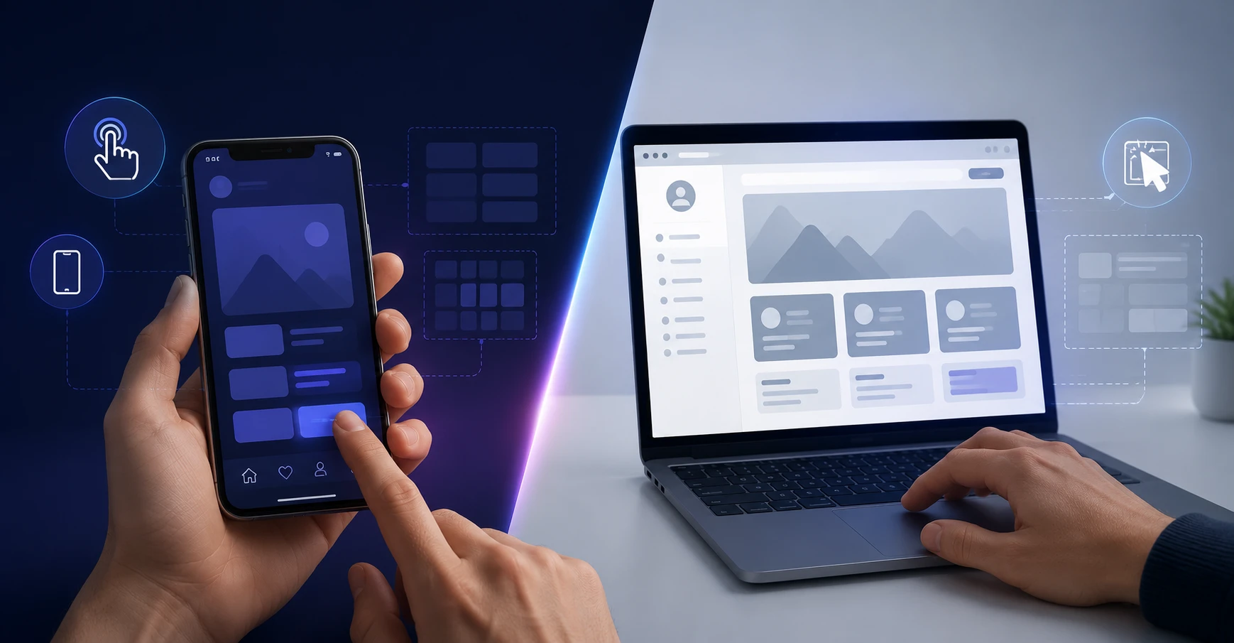
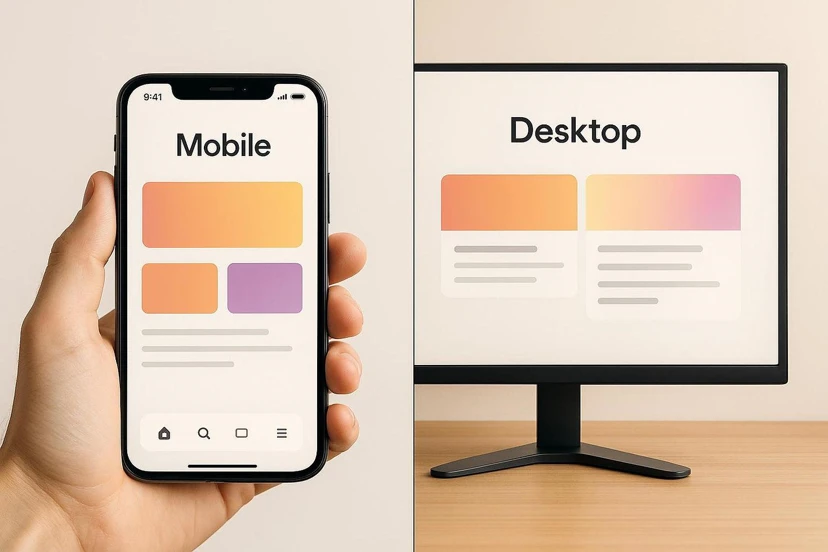
The difference between mobile and web UI design goes far beyond screen size. It extends to user behavior, interaction patterns, and expectations.
Mobile users expect fast, simple, and task-oriented experiences. They usually aim to complete specific actions quickly. On the other hand, web users are often more willing to explore, read, and compare information.
Interaction also differs significantly. Mobile relies on touch gestures, while web depends on clicks, scrolling, and keyboard input. These differences require distinct design approaches tailored to each platform.
At Pishgaman Lotus, we emphasize designing based on user behavior within each platform rather than applying a one-size-fits-all solution.
Design Limitations
Each platform comes with its own set of limitations that must be carefully considered.
In mobile design, the biggest constraint is screen size. Designers must prioritize content and avoid clutter. Performance optimization is also critical to prevent excessive battery and resource usage.
In web design, challenges are more technical and environmental. Internet speed, browser differences, and security concerns can all impact user experience. Designers must ensure that their interfaces perform consistently across various conditions.
Shared Design Principles
Despite their differences, mobile and web UI design share fundamental principles.
User-centered design is at the core of both. Interfaces should be built based on user needs, behaviors, and expectations. Consistency is equally important, helping users feel familiar and comfortable while navigating.
Clarity, simplicity, and effective feedback are essential in creating smooth and enjoyable user experiences. These principles are deeply integrated into every project at Pishgaman Lotus.
Conclusion
There is no definitive answer to whether mobile or web design is better. Each serves different purposes and audiences. The right choice depends on business goals, user needs, and the nature of the product.
In many cases, the best strategy is to use both platforms in a complementary way. What truly matters is understanding their differences and leveraging their strengths effectively.
Successful UI design is not just about visual appeal—it is about creating seamless, efficient, and meaningful experiences. At Pishgaman Lotus, we combine strategy, creativity, and user insights to deliver designs that truly make an impact.
Our articles:"Design Systems: The Hidden Backbone of Digital Products"



Have special project to begin?
Contact us if you need a unique website for your special requirements, if you think having a mobile application help you reach your business’s goals or you still do not recognize which product can help you implement your ideas. Lotus Pioneers accompany you to develop your business through consulting and by designing special products.