Micro-interactions in Apps: The Secret to Better UX
Micro-interactions in Apps

Micro-interactions: Small Details That Make Users Love Your App
In today's application design landscape, competition is not only about the number of features or an attractive visual appearance. Sometimes, what makes an application feel truly enjoyable is a collection of very small details—from a short animation when a user taps a button to a subtle vibration when an action is completed successfully.
These small details are known as Micro-interactions. When designed correctly, they can transform the user experience of an application from an ordinary interface into a smooth, engaging, and memorable experience. According to Nielsen Norman Group, micro-interactions generally represent a relationship between a trigger and feedback, and they can communicate system status, prevent errors, and even contribute to brand identity.

What Is a Micro-interaction?
A micro-interaction is a small and purposeful interaction between a user and a digital product. It is usually designed to perform a specific task and provides an appropriate response to a user's action or a change in the system's state.
For example, when a user clicks a "Save" button and the button briefly changes its state, a checkmark appears, or a small "Saved" message is displayed, a micro-interaction has taken place.
Common examples include:
Changing the state of a button after it is clicked
Displaying a loading indicator while processing information
Animating an item when it is added to a shopping cart
Showing a checkmark after a successful operation
Providing subtle vibration feedback when an error occurs
Changing the state of toggles and switches
Showing a "typing..." indicator in messaging applications
Pull-to-refresh animations
Displaying success or error messages
It is important to note that not every animation or movement in a user interface is necessarily a micro-interaction. A trigger, a specific response, and a clear purpose are important components of the concept.
Why Are Micro-interactions Important?
Users constantly send commands while interacting with an application. If the system does not provide any visible response, users may not know whether their action was registered, whether the application is processing the request, or whether their click was recognized at all.
Micro-interactions eliminate this uncertainty.
For example, imagine that a user clicks the "Pay" button in an application, but nothing happens on the screen. After a few seconds, the user may click the button again. This can potentially result in duplicate requests or create confusion.
However, if the button immediately changes to a "Processing" state, the user understands that the request has been received.
For this reason, micro-interactions can help communicate system status, prevent errors, increase engagement, and establish a recognizable visual identity for a product.
The 4 Key Components of a Micro-interaction
A successful micro-interaction generally consists of several important components.
1. Trigger
A trigger is the event that starts the interaction.
It can be a user action such as:
Clicking
Tapping
Swiping
Entering information
Holding a button
It can also be generated by the system itself, such as receiving a new message or completing a process.
2. Feedback
After the trigger occurs, the system should provide an appropriate response.
This response can be visual, auditory, or even tactile.
For example:
User: Clicks the Like button
System: The heart icon changes state and a short animation appears.
The user immediately understands that the action has been completed without needing to read additional text.
3. Rules
Every micro-interaction should have clearly defined behavior.
For example, if the user clicks the Like button again, should the Like be removed? Should the animation play again? Are there any limitations?
Defining these rules makes the interface behavior predictable.
4. Loops & Modes
Finally, designers need to determine how an interaction behaves under different circumstances.
For example, a button may have different appearances in its normal, loading, successful, and error states.
This is particularly important in professional applications because it creates a consistent experience throughout the product.
Practical Examples of Micro-interactions in Apps
1. Smart Buttons
One of the simplest and most useful examples of a micro-interaction is changing the state of a button.
Imagine that a user clicks "Submit." The button can temporarily enter a loading state and then display a checkmark after the operation is successfully completed.
These small changes communicate a clear sequence:
Request received → Processing → Success
In professional application design, these details can help prevent repeated clicks and reduce user confusion.
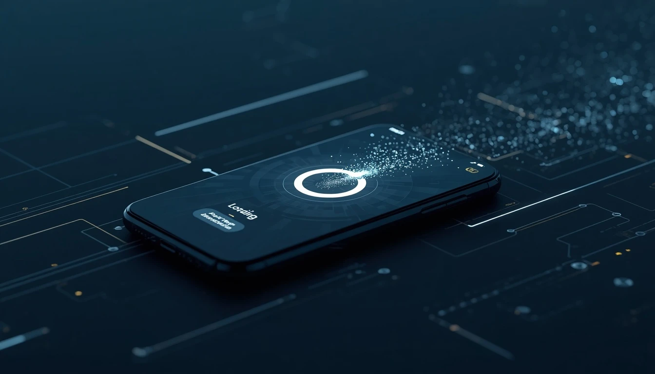
2. Loading Animations
One of the worst experiences for users is a screen that provides no response after an action.
A suitable loading indicator informs users that the system is still processing their request.
This becomes especially important in applications that communicate with servers, APIs, or AI services.
For example, in projects developed by Pishgaman Lotus, different interface states—from waiting and processing to success and error—can be considered from the beginning of the UI/UX design process.
3. Haptic Feedback
Sometimes the best feedback is not visual.
A very short vibration when an action is completed successfully can inform users that their command has been registered.
This can be useful for:
Fingerprint authentication
Activating an option
Completing an order
Selecting an item
Making a payment
Haptic feedback can make the interaction feel more natural.
However, excessive use of haptic feedback can become annoying, so its intensity and timing should be carefully designed.
Micro-interactions in Forms: Preventing Errors Before They Happen
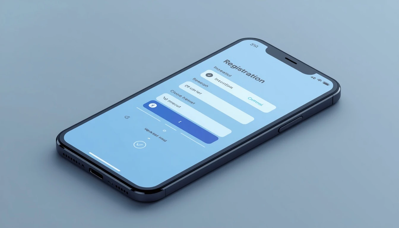
One of the most important applications of micro-interactions is error prevention.
Imagine that a user is creating an account and entering a password.
Instead of waiting until the user clicks "Sign Up" and then displaying "Invalid password," the application can validate the password requirements while the user is typing.
For example:
✓ At least 8 characters
✓ Contains a number
✓ Contains uppercase letters
✗ Contains a special character
The user immediately understands what needs to be changed.
This type of real-time feedback reduces unnecessary repetition and friction throughout the user journey.
Animation: Engagement or Distraction?
One common mistake in micro-interaction design is assuming that more animation automatically means a better user experience.
The primary purpose of a micro-interaction is not to entertain the user. Instead, it should provide information or make an interaction feel more natural.
For example:
Good:
After selecting a product, the shopping cart icon changes briefly.
Bad:
Every click triggers long and distracting animations across the screen.
Animations should be short, purposeful, and proportional to the importance of the event.
In professional designs by Pishgaman Lotus, micro-interactions can be treated as part of the overall product experience rather than simply decorative effects.
The Role of Micro-interactions in Branding
Micro-interactions are not only about usability; they can also become part of a brand's personality.
Colors, movement, speed, sound, and even the type of feedback can communicate a specific feeling to users.
A financial application may use very simple and formal interactions, while an entertainment application can use more energetic animations.
Therefore, micro-interactions can become part of a brand's design language.
Nielsen Norman Group also identifies communicating brand identity as one of the important applications of micro-interactions.
Micro-interactions in Mobile Applications
In mobile applications, these details can be even more important because users constantly interact with interfaces through taps, swipes, gestures, and haptic feedback.
For example:
Swipe:
The user swipes a card to the right and the card smoothly leaves the screen.
Pull-to-refresh:
When the user pulls the page downward, an animation indicates that new information is being retrieved.
Toggle:
When an option is activated, the switch smoothly changes its state.
Notification:
When a new message arrives, a small indicator appears on the icon.
These simple interactions make users feel that the interface is directly responding to their actions.
How to Design Effective Micro-interactions
To create a professional micro-interaction, it is better to start with the user's needs rather than immediately thinking about animation.
Step 1: Identify the Problem
Determine where users become confused or uncertain while using the application.
Step 2: Define the Trigger
What event should start the interaction?
Step 3: Choose the Right Feedback
Should the feedback be visual, auditory, tactile, or a combination of these?
Step 4: Adjust the Timing
The interaction should not take so long that it makes the user wait.
Step 5: Design Different States
Normal, loading, success, error, and recovery states should all be considered.
Step 6: Test on Real Devices
Something that looks excellent in a design file may feel too fast, too slow, or distracting on an actual smartphone.
The Role of UI/UX in Successful Micro-interactions
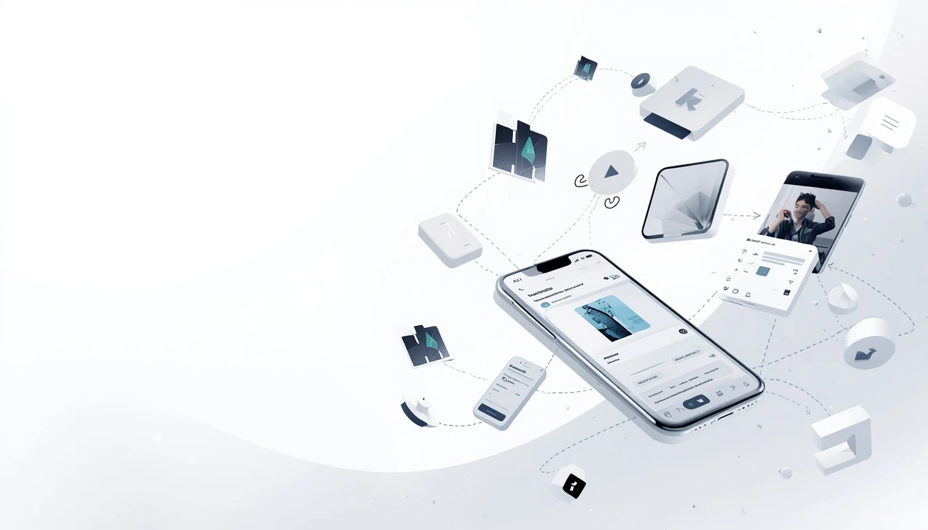
A successful micro-interaction is the result of collaboration between design, user experience, and technical development.
If a designer focuses only on appearance, the result may be visually attractive but impractical. On the other hand, if a developer implements the interaction without considering the user experience, its timing and behavior may not be appropriate.
This is why Pishgaman Lotus can approach UI/UX design and application development as interconnected processes, ensuring that small interactions remain consistent with the product's architecture and functionality.
This becomes particularly important for complex applications, online stores, enterprise software, and AI-powered products.
Common Micro-interaction Design Mistakes
Using Too Much Animation
If everything moves, nothing feels particularly important.
Delayed Feedback
Users should understand as quickly as possible that the system has received their command.
Designing Without a Purpose
Every micro-interaction should have a clear reason to exist.
Ignoring Accessibility
Important information should not be communicated only through color or animation. Different users should be able to understand changes in system status.
Inconsistency With the Brand
The interactions of a serious financial or enterprise application should not unnecessarily look like those of a children's game.
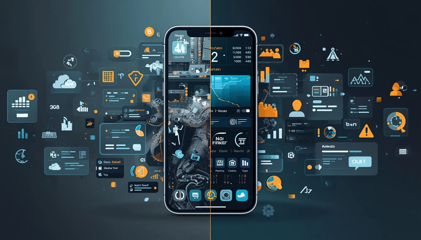
The Future of Micro-interactions: Smarter Interactions
With the integration of artificial intelligence into applications, micro-interactions can become smarter as well.
In an AI-powered application, the system can provide different types of feedback based on the user's state, activity, or processing results.
For example, an intelligent assistant can display different processing states while handling a request or create a subtle interface transition when a response becomes available.
Combining AI, UI/UX design, and micro-interactions can create a new generation of interfaces that are not only responsive but also easier to understand and more human-centered.
This approach can be particularly valuable for teams such as Pishgaman Lotus, which work on digital products and intelligent technology solutions.
Conclusion
Micro-interactions may occupy only a few pixels or last for a fraction of a second, but their impact on the user experience can be significant.
A button that responds correctly, a loading indicator that communicates system status, an appropriate error message, or even a short vibration can make the difference between an ordinary application and a professional digital product.
Ultimately, an excellent user experience is built from many small details.
Designing these details correctly requires an understanding of user behavior, UI/UX design, technical performance, and continuous
testing. These areas can work together throughout the development of digital products at Pishgaman Lotus.
Micro-interactions are not simply meant to make an application look better. Their main purpose is to make the product simpler, clearer, faster, and more enjoyable to use.
Our articles:"AI-First UI Design: Transforming User Experience with AI"
Blog Tags
Similar Blogs


Have special project to begin?
Contact us if you need a unique website for your special requirements, if you think having a mobile application help you reach your business’s goals or you still do not recognize which product can help you implement your ideas. Lotus Pioneers accompany you to develop your business through consulting and by designing special products.