Beyond Breakpoints: The Future of Fluid Web Design
Beyond Breakpoints


Introduction: Why Responsive Design Is No Longer Just About Breakpoints
In the early days of web design, Responsive Design mainly meant defining a few breakpoints for mobile, tablet, and desktop. But today, users access websites through an incredibly diverse range of devices—from smartwatches to ultra-wide monitors.
At Pishgaman Lotus, we’ve learned that modern design must go beyond rigid breakpoints.
It needs to be fluid, adaptive, and continuous.
Instead of jumping between fixed layouts, interfaces should scale smoothly across all screen sizes, delivering a consistent and seamless user experience.
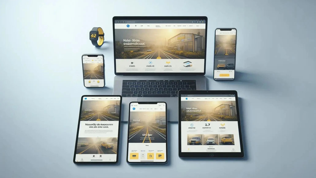
Breakpoint-Based vs Fluid Design
Traditional breakpoint-based design relies on predefined screen widths where layouts change abruptly. While this offers control, it often creates awkward experiences between breakpoints.
Fluid design, on the other hand:
- Scales continuously instead of jumping
- Adapts to any screen size naturally
- Provides a smoother user experience
At Pishgaman Lotus, the most effective approach is combining both:
- Breakpoints for structural shifts
- Fluid behavior for everything in between
The Role of Fluid Units in Modern Design
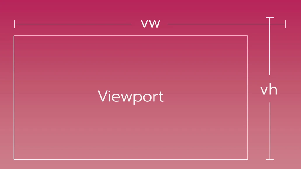
Fluid design is powered by relative units rather than fixed ones.
Instead of static measurements, modern layouts use units that adapt to:
- Screen size
- Parent elements
- User preferences
This results in:
- Flexible spacing
- Better scalability
- More natural layouts
In real-world projects at Pishgaman Lotus, fluid units are essential for building future-proof interfaces.
Fluid Typography
Typography is one of the most critical parts of user experience.
If text is too small on mobile or too large on desktop, usability suffers.
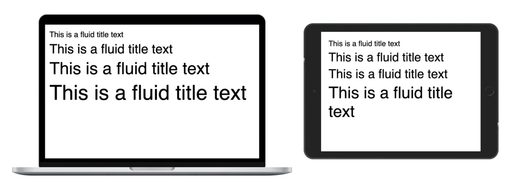
Fluid typography solves this by:
- Dynamically scaling text sizes
- Maintaining visual hierarchy
- Ensuring readability across devices
At Pishgaman Lotus, fluid typography plays a key role in delivering consistent and professional UI/UX.
Flexible Grids
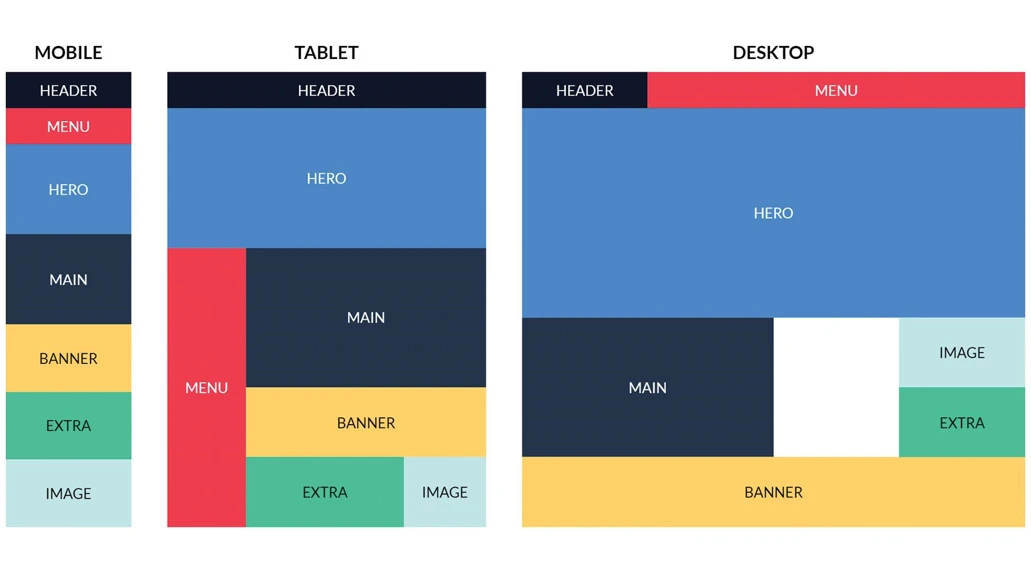
Flexible grids are the backbone of modern responsive layouts.
Instead of fixed columns, they:
- Automatically adjust to available space
- Reflow content dynamically
- Maintain alignment and spacing
This allows designers to create layouts that are:
- Scalable
- Maintainable
- Device-independent
At Pishgaman Lotus, combining grid systems with flexible behavior ensures robust and adaptable designs.
Reducing Dependency on Media Queries
Traditional responsive design heavily depends on media queries, which can quickly become complex and hard to maintain.
Modern approaches aim to:
- Minimize media query usage
- Let layouts adapt automatically
- Simplify codebases
Based on experience at Pishgaman Lotus, leveraging fluid techniques significantly reduces the need for excessive breakpoints.

Container Queries: The Future of Responsive Design
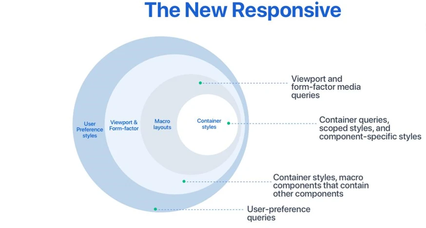
Container Queries represent a major shift in how responsive design works.
Instead of responding to the viewport, components respond to their own container size.
Benefits include:
- True component-based design
- Better reusability
- Greater flexibility
At Pishgaman Lotus, this approach enables scalable design systems and modular UI development.
Responsive Images
Images are essential—but also one of the biggest performance challenges.
Responsive image strategies ensure:
- Proper image sizes for each device
- Faster loading times
- Improved user experience
At Pishgaman Lotus, image optimization is always integrated into the design process—not treated as an afterthought.
Performance in Responsive Design
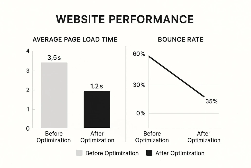
Responsive design is not just about visuals—it’s also about performance.
A beautiful design that loads slowly fails users.
Key considerations:
- Load speed optimization
- Resource efficiency
- Mobile-first performance
- Network-aware design
At Pishgaman Lotus, performance is built into every stage of the design process.
Professional Best Practices
To achieve high-quality responsive design, follow these principles:
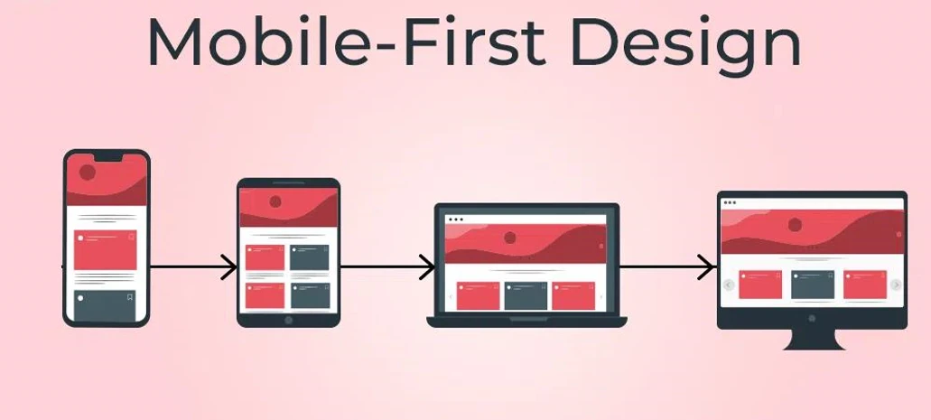
- Start with a Mobile-First approach
- Use a Design System
- Prioritize user experience
- Test on real devices
- Keep designs simple and scalable
These principles are standard practice at Pishgaman Lotus.
Conclusion
Responsive design has evolved far beyond simple breakpoints.
To succeed, designers must:
- Think fluidly
- Use flexible grids
- Implement dynamic typography
- Prioritize performance
At Pishgaman Lotus, we believe responsive design is not just a technique—it’s a mindset.
Our articles:"From Touch to Click: Key Differences in Mobile vs Web UI Design"



Have special project to begin?
Contact us if you need a unique website for your special requirements, if you think having a mobile application help you reach your business’s goals or you still do not recognize which product can help you implement your ideas. Lotus Pioneers accompany you to develop your business through consulting and by designing special products.